Back to Home
Hipcamp Audit and Redesign
DELIVERABLES
ROLE
Hipcamp is a digital marketplace for booking outdoor camping experiences. I took a look at Hipcamp’s digital experiences and saw a number of opportunities for improvement in the mobile app.
I identified 3 interconnected areas where Hipcamp could improve its consumer-facing experiences using foundational design principles:
Accessibility
Standardization of language
Standardization of UI elements
Ultimately, many of these problems would be best solved upstream by defining an accessible, universal design system and language guidelines across their suite of experiences.
Disclaimer: I do not work for Hipcamp. This is just a fun project to show off where my UX and UI chops are at without needing to wiggle around an NDA. It’s not a super structured case study with user interviews, personas, and the lot. I’m focusing more on design craft and principles here.
1. Accessibility
Hipcamp fails to meet many of the Web Content Accessibility Guidelines (WCAG), though I’ll focus mostly on those involving color contrast of text, buttons, and links — chiefly visual things.
That said, I will not focus on improvements to their voice-over or text-to-speech functionality; partly because I’ve time-boxed myself, partly because I’m not fully qualified, and partly because there are services that could do a far more comprehensive job than I can. Click here for more information about text-to-speech. Click here for more information about audio description of visual information.
According to the national eye institute, approximately 4.5% of the total population have some kind of color insensitivity. There are legal standards for color contrast as well. Section 508 and WCAG 2.0 Level AA requires a baseline contrast standard of 4.5:1 for most text and 3:1 for large text. We probably all know someone with some kind of visual impairment; increasingly, those people are our parents and grandparents.
Hipcamp fails to meet this contrast baseline in many places because of their use of sea foam/aquamarine/ocean green #58C28A.

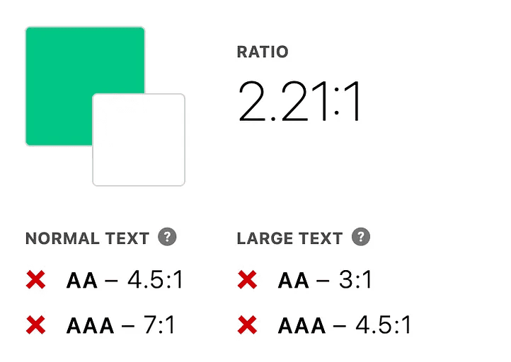
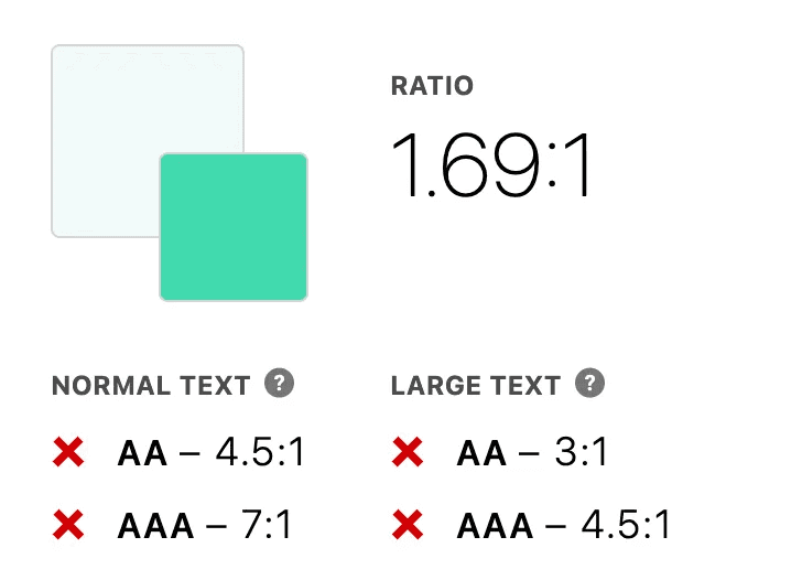
This green is everywhere, and does not provide enough contrast to meet the AA baseline. It’s even less compliant when used in filters above a very light green, #F4FBFB.
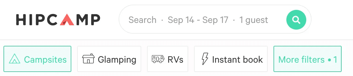
The result of checking the contrast of the text on the background of each filter element
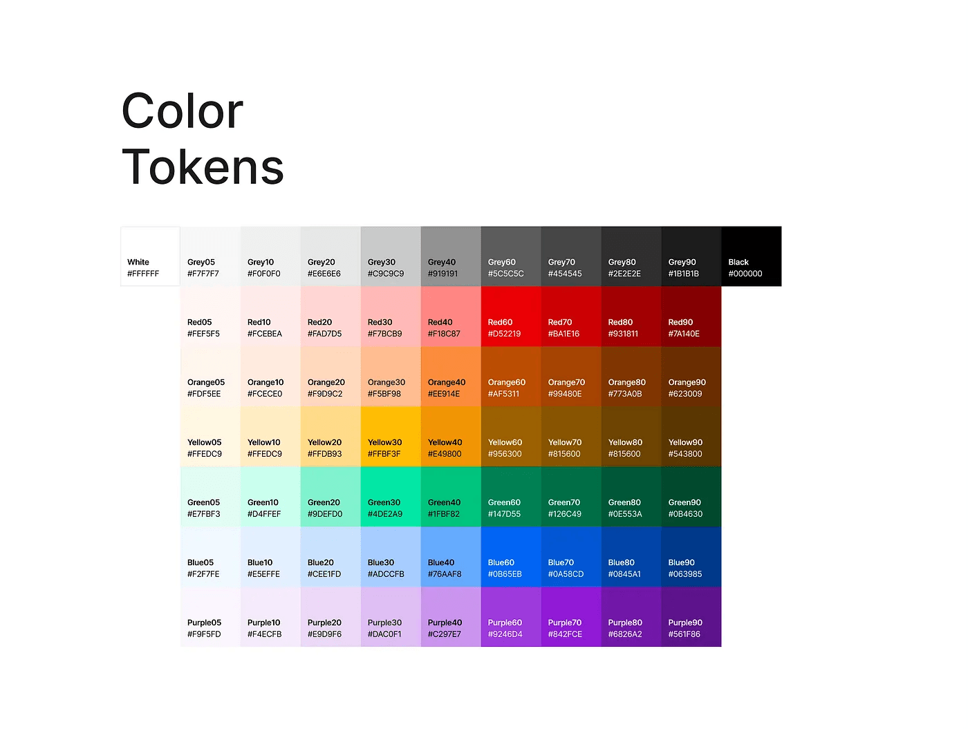
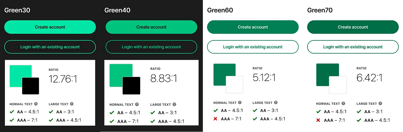
Fortunately, this is a simple fix. I took the liberty of defining some accessible Hipcamp colors using the “magic number” method, where each color is given a number (example: gray-90 or blue-20) depending on where it sits in a luminance range.
Once these colors are defined, you can easily determine sufficient contrast by subtracting the larger number from the smaller number. With my color tokens, if the result is
<50, it would not be sufficiently accessible for any sized text (does not pass 4.5:1).
50+, it successfully meets WCAG 2.0 AA Large Text contrast (passes 3:1)
60+, it successfully meets WCAG 2.0 AA contrast or AAA Large Text contrast (passes 4.5:1)
Here’s my recommended color tokens:
With this method, Green60 and Green70 would provide sufficient color contrast in light mode buttons with 16pt, white text. Green30 and Green40 would provide sufficient color contrast in dark mode with 16pt, black text.
Here are the semantic color tokens that I’ll use throughout my components:
Color options defined for text, icons, objects, or outlines
I’m going to use Green60. Here we can see this new green in action. It’s much more readable.
Mobile app messaging center
Though this is mostly a mobile case study, I made similar changes for the web search and filtering experiences as well.
Web search and filtering
You may notice that
I changed some of the other attributes of these experiences (i.e. chips instead of square buttons, dropping “here” from the primary button call-to-action, etc…).
My phone needs charging.
Re #1: I’ll explain those other changes in a sec. Re #2: Don’t worry, I reached an outlet.
The second bit of improvement I’ll focus on involves visual affordances. Below is their mobile settings/profile page.
The settings page in the Hipcamp app
I annotated a few things about this page.
All list menu items except for Notification preferences rely solely on text to indicate interactivity. I think the chevron is meant to indicate there is additional navigation beyond Notification preferences, but that is simply not necessary and a pretty uncommon pattern.
The links to the terms of service and privacy policy have insufficient visual affordances to indicate their interactivity. This is also a problem with unordered links I’ve seen elsewhere (see below).
The bottom navigation relies on a very subtle color difference to indicate which tab is selected.
Links that are unordered and lack sufficient visual affordances
Here’s how I’m solving these problems on the settings page:
Hipcamp profile page redesign
Any buttons that were simply text are now underlined.
All list items have an accompanying icon to indicate interactivity.
The selected menu item in the bottom navigation contains a black filled icon, and black semibold text. Non-selected items contain an outlined icon and medium weight label in Grey70.
Introduces a Profile page title, creating consistency with other pages. This is also a WCAG 2.1 level A requirement.
My approach adds labels to the bottom navigation, which improves clarity and is an accessibility requirement for non-universally recognized icons.
Some more examples of Hipcamp experiences that are not compliant with WCAG 2.1
There are certainly some other needed accessibility red flags I did mention, like text atop images that don’t provide enough contrast, carousels without pagination or easy access to a list view, input fields with no permanent labels, and so on…
These things are all solvable.
2. Standardization of language
Terminology and writing guidelines are two of the first items in the Design Systems Checklist for good reason. They require your team to make fewer feature-to-feature decisions, make it easier for your customer support teams, and reduce the risk of mismatched terms that slow down customers from completing tasks or degrade trust.
I noticed a number of language inconsistencies across Hipcamp’s experiences, but I’ll talk about three here.
What do you call a listing?
Capitalization in buttons
Nouns vs. actions
2a. What do you call a listing?
There may be perfectly good reasons for the current rationale, but there are inconsistencies in what they call their product in certain global pages.
I’m sympathetic to this problem. Hipcamp doesn’t offer only “campsites,” they offer cabins, treehouses, and furnished camper vans. Somehow, Hipcamp will need to come up with a term that encompasses all of these things. The solution is probably best found by conducting a user test or listening to customer calls to see what users naturally call these things, unprompted. Regardless, I’ll offer my POV.
“Camps” — my #1 choice
Pros: Generic. Short. Universal. May be generic enough to be inclusive of all their listings.
Cons: May not be generic enough to be inclusive of all their inventory.
“Hipcamps” — my #2 choice
Pros: Unique. An abstract concept that is certainly inclusive of all their listings, because “Hipcamps” can be whatever Hipcamp wants them to be.
Cons: Hipcamp isn’t necessarily inventing a new commodity in the way that Airbnb did by offering “Airbnbs” or Uber did by offering “Ubers.” That said, it doesn’t seem like either company uses those words to refer to their listings; Airbnb calls their inventory “stays” and Uber calls theirs “rides.” The majority of Hipcamp’s listings look and feel like what we’d call “camps” or “campsites.” By calling their listings “Hipcamps,” it requires customers to add another word to their vocabulary, and it could get confusing if customers miss that final letter and think it’s referring to the company.
“Sites” — my #3 choice
Pros: Generic. Short. Universal. May be generic enough to be inclusive of all their inventory.
Cons: May not be generic enough to be inclusive of all their listings. Something about “sites” feels connected to “websites” or “construction sites.” A “site” feels like it’s further away from cabins, treehouses, and furnished camper vans than “camps.”
“Campsites” — my #4 choice
Pros: Specific to most of their inventory. Universal.
Cons: I ultimately think this is what they should call their tent and vehicle parking inventory. A “campsite” feels like it’s further away from cabins, treehouses, and furnished camper vans than “camps.”
Why is this important?
What Hipcamp calls a listing is important to define, as it’s a shared term guests may use with one another, their hosts, and Hipcamp’s customer support.
It also provides the grounding for other key terms. By defining what a listing is called, we get a simple “adjective noun” or “verb noun” structure we can use and reuse.
For example, “Saves” are what what Hipcamp calls listings that a customer has saved. They could probably do without creating a new noun for customers to have to conceptualize, especially when it’s not a new thing — it’s an existing thing with a new attribute. We can use our new structure to get us “saved camps.” This can be extended to other use cases, like “booked camps,” “selected camps,” or “share camp.”
Here’s a quick glossary of some terms Hipcamp could use:
camp, noun, a generic listings that hasn’t been booked
trip, noun, a generic upcoming or previously booked camp
upcoming trip, noun, a trip that has been booked, but has not occurred yet
current trip, noun, a trip that was booked and the stay is happening now
past trip, noun, a trip that was booked and the stay is complete
campsite, noun, a tent and vehicle camp
lodging, noun, an indoor/glamping camp
book, verb, reserve and pay for this camp. Only use as a verb.
booking request, noun, a request to book a camp that the Host must approve
log in, verb, to use credentials to access an account
log out, verb, to exit account access on a device
Host, noun, the landowner offering a camp. Always capitalized.
host, verb, the act of offering a camp on Hipcamp. Always lowercase, unless at the beginning of a sentence.
guest, noun, a person who will stay at a campsite.
2b. Capitalization in buttons
This one is a quick fix. Some buttons currently use title casing, some use sentence casing, some are all caps. They should really pick one approach and stick to it.
For this exercise, I’m going to sentence case everything that isn’t a proper noun.
2c. Nouns vs. actions
It’s generally recommended that we use action-oriented language in experiences when want a user to take action. Hipcamp does this in most places, though in some places it falls short.
“Instant book” could be updated to “Book instantly.” I’ve seen Airbnb use this phrase as well, which I find strange, considering “Book instantly” is right there, metaphorically speaking. It’s also right above another badge that does the right thing and uses “Book” as a verb.
Some actions like “Request to book” is in need of a noun to ground it, otherwise it’s “verb to verb.” I might suggest “Send a booking request,” or “Request this camp,” or even, “Request to book this camp.”
They should also set grammatical rules for some key terms like “Host,” so it’s capitalized when referring to a person (i.e. “When you meet your Host…”), but all lower-case when it’s an action (i.e. “If you want to host…”).
Hipcamp also uses “Login,” which is a noun, when it should be “Log in,” an action.
3. Standardization of UI elements
As you can probably see from the screenshots above, there a couple of different visual components being used through out the Hipcamp experiences.
Like standardizing language, a shared UI kit or design system requires your team to make fewer feature-to-feature decisions and reduces the risk of mismatched elements that slow down customers from completing tasks or degrade trust.
Design systems are hard, but probably worth doing sooner rather than later. Craig Villamor, who led Design Systems at Salesforce has said “the more decisions you put off, and the longer you delay them, the more expensive they become.”
Here, we can see arbitrarily unique button styles.
Text input styles also vary.
There are also some inconsistent page layouts as well.
Icons also styled differently throughout the app, with some being 1pt stroke, and others being 2 (maybe 2.5pt?) stroke.
Instead of nitpicking more things, I fleshed out enough of a UI Kit that I could use to redesign a few pages.
Why did I call this a UI kit and not a design system? Because a “design system” implies that counterparts of these exist in code, which they do not. It’s also incomplete and doesn’t describe enough components to cover every Hipcamp screen.
It may be generous to call this a UI kit, considering I’m free-wheeling a bit with the type ramp, but I’ve timeboxed myself for this project and I’m running out of room.
With these components, I started redesigning a few key spaces.
I initially was going to include a redesign of the Hipcamp search experience in this as well, but I’ve already sunk too much of my personal time in this. And, you know, perfect is the enemy of good and all that.
There’s obviously quite a bit more to UX and UI than just flat mocks, but this feels like a step towards a more scalable and inclusive experience. Much thanks to Hipcamp for offering a rad product, and my apologies to Carl E, whose lovely face and campsite I swapped out for some random photos from Unsplash.